Brand symbol
The name Kyorin originated from two Chinese characters that represent a truly virtuous way of practicing medicine.
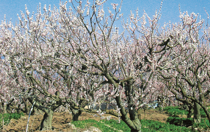
Long ago, a Chinese physician named Dong Feng treated the sick free of charge, and asked those who recovered from serious illness to plant five apricot tree saplings and those cured of minor illness to plant one. As time went by, a thick forest of apricot trees was formed in the area. (A story that comes from a Chinese legend named Shinsen-den). “Kyorin” is a compound of “kyo,” the Chinese word for “apricot,” and “rin,” the Chinese word for “woods.” Praising the virtue of Dong Feng, the characters were transported from China to Japan as those representing medicine and medical treatment in general.
Today, we use phonetic representation of the Chinese characters in katakana as our company name and that in the Roman characters "Kyorin" in our company logo.
Passion embedded in the brand symbol
The brand symbol conveys the image of “Smiling society” to which the KYORIN brand is committed, and to achieve this, KYORIN’s determination to take “Flexible and bold actions” and its desire to be externally “Trusted and reliable.”
Corporate Mark
The corporate mark consists of three curved lines that form a heart shaped apricot. The lines represent the smiles of patients, their families, and workers in medical services, as well as Kyorin’s three core businesses, namely prevention, treatment, and prognosis.
- Orange:Honesty and warmth
- Violet:The technology that brings confidence
- Light green:Free and lively creativity
Company name logotype
The font style is friendly, yet fresh, energetic and dynamic.